
Stop Letting Your Homescreen Waste Its Potential
Most homescreens look full, but they often don’t help users make a quick decision. After a long day, people open the app, scroll briefly, and either find something to play or give up. If it takes too long, they leave.
Do you believe your users can easily find something to watch? If your homescreen is built only from basic strips, you’re not really helping users decide what to watch. You’re just showing them options instead of guiding them.
TV content works differently from VoD because it depends on the EPG schedule. Content appears and disappears based on EPG timeslots, which means that a strip built on specific programs can suddenly become empty. The key is to plan for it and keep the homescreen feeling complete.
You can do that by:
- Showing content from a longer time window or ongoing series with new episodes added regularly.
- Using a broader, more stable selection (for example combining multiple channels) so the strip is less likely to go empty.
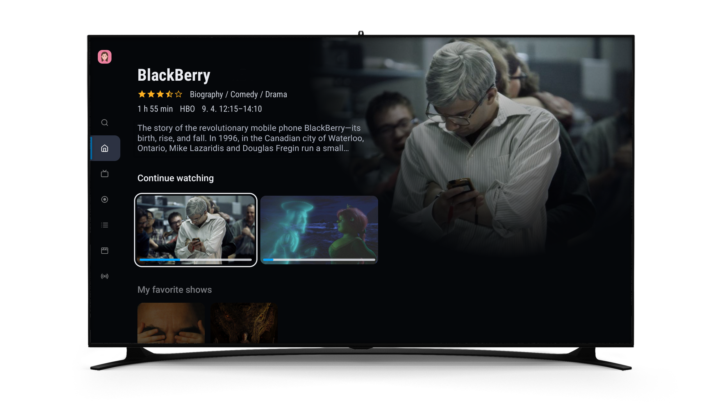
A homescreen should always feel alive. Not all strips are equal. Some are used every day, while others are mostly ignored. The ones that work best are often highly personalized and reflect what users actually watch.
Two highly personalized strips usually stand out:
- Continue Watching – the first place users go, familiar and effortless
- Favorite Channels – a quick shortcut to content users already trust
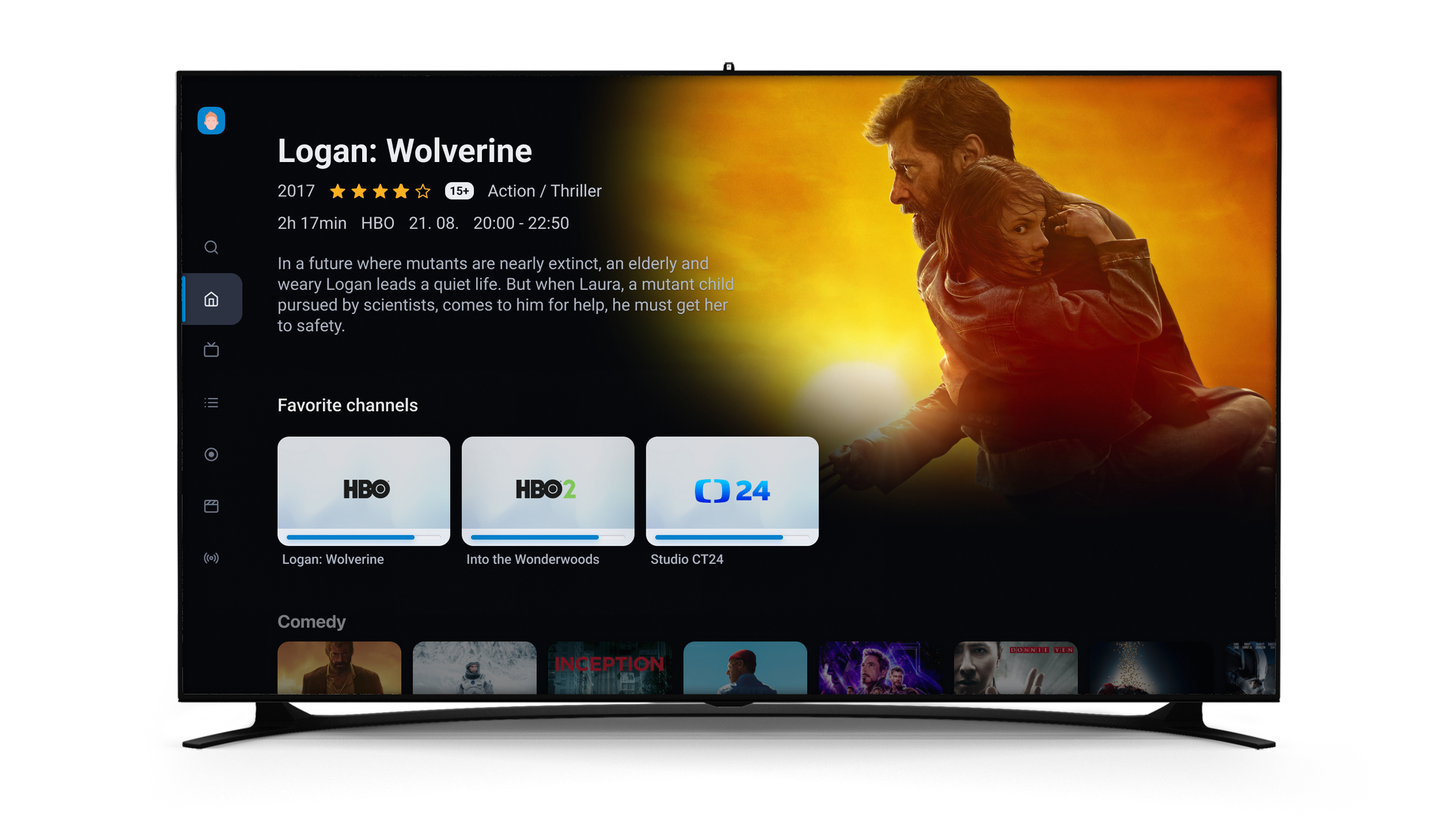
If these two strips are missing, hidden, or not working properly, the rest of the homescreen loses much of its impact.
Another common issue is trying to do too much in one strip. Mixing genres, purposes, and content types usually leads to one result: users scroll, but nothing stands out.
Each strip should have a clear purpose. For example:
- What is on right now
- What is coming soon
- What can I watch from my package
- What fits my mood
When strips are easy to understand, users don’t have to think. They just choose.
The homescreen is also where users can see what they actually have. If you offer packages or channel bundles, this is where their value becomes visible.
Bring content forward instead of hiding it:
- show what’s included
- promote selected events or themes
Strips are great for quick browsing, but sometimes they are not enough. Collections give content more structure and make it easier to explore.
You can group movies by genre, bring sports events together, or connect full series. Users can stay in one place and discover more.
Make Key Content Stand Out
Visuals also play an important role. Poster size helps users understand what matters.
- Bigger visuals attract attention
- Smaller ones make browsing faster

A simple balance works best: highlight key content and keep the rest easy to scan.
At the end of the day, the goal is simple. Help users find something to watch in seconds, not by adding more content, but by organizing it better.
Because a good homescreen doesn’t feel full. It feels effortless.
If you’re not sure how to set up your homescreen or want to get more out of your strips, we’re here to help. We have a video tutorial that walks you through the setup step by step, and you can also learn more in our article about one of our ModernTV app updates, where we introduced a faster, more intuitive, and visually improved experience.
Just reach out to us and we’ll be happy to share it with you.


